| Getting Serious about Self-Publishing by Ronald L. Donaghe I'm reminded of an often given, seldom heeded, piece of advice that well meaning people give those with emotional problems when their behavior becomes self-damaging. "You need to seek professional help." It's kind of like that with self publishing. As I've said in other columns in this newsletter, many self-published writers (myself included) hurt their chances of sustained success—or even initial sales—when they don't exercise strict discipline with grammar, punctuation, spelling, and word choice. But there's more to it than that. This article considers additional factors writers (myself included) must perfect in self-published work. |
|
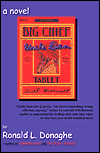
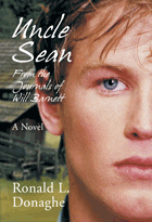
You may wonder what the book covers have to do with getting serious about self-publishing. Well, I’ll tell you. With most self-published books and especially with print-on-demand books, one of the first introductions a potential reader/buyer has with your work is an internet bookstore and a thumbnail cover graphic. While you can’t judge a book by its cover, the cover potential customers see will often determine whether or not they will make that essential click to the next page, where a blurb about the contents can be found. In a brick and mortar bookstore, the same principle applies. The cover has to grab potential buyers within a matter of a second or two and the back cover copy has to hold their attention for a few more seconds. If not, they move on. The cover graphic is one factor a self-published writer must be serious about. I’ll talk more about this later, but here is a short list of factors that will aid in successfully marketing your book to potential buyers and leaving them with a sense of promises made and kept.
The Blurb Here’s a sample of a blurb that caused me to buy a book on the spot: Paul Reynolds, a photographer who
creates fake photos for tabloid magazines, wakes up with no idea where
he is or how he got there. He can’t even recall his name. A strange man
lurks nearby, breathing heavily and slowly flipping through a book.
Paul hears the man’s breath, but he cannot see him. He realizes with
mounting panic that his eyes no longer function.
He remembers racing down a desolate West Texas highway. He remembers a cop who pulled him over for speeding. He remembers a shotgun-brandishing cook chasing him out of a diner. And he remembers a life abandoned, but he cannot put together the jigsaw puzzle that brought him where he is: blind, wanted by the law, and in the company of this invisible stranger. In the backcountry town of Armbister, Texas, where temperatures hover around a hellish 110 degrees, Paul’s memory, intangible as a heat mirage, lies just beyond his reach, and God may be a coyote. I was not disappointed when I read the book, either. The blurb touches on key points in the novel, causes an empathetic and anxious reaction in the reader about the character’s circumstances, draws the potential reader into the setting, and ends with a most intriguing left-field kind of fact: “and God may be a coyote.” I wasn’t disappointed in the book, because the story delivered on the promises of the blurb. So, in your own promotional blurb writing, you need to be serious and to carefully consider how to draw the reader into the story, how to grab the reader with a surprise fact or incident, and how to make promises that the story will deliver. The format and font choice of the text The left and right margins of the page should appear equal in size. I say “appear” equal because the left (odd numbered page) gutter will be used by the binding, and the reverse for the right gutter on even numbered pages. However, some self-published books are troubled by a wide margin toward the center of the open book. Paragraph indentations should be minimal, rather than the manuscript indentation of a full half-inch. The font should be a readable serif font, not sans serif. The text should be left- and right-justified, but a proportional spacing font with tight kerning should be used to reduce the gaps between words. Most POD publisher/printers are fine with this format and font factor. If your printer or your POD publisher is not, you should insist that they improve the look of the printed page. Don’t allow them to put out a bound book that looks more like a single-spaced manuscript. The edited quality of your work This is that old grammar, punctuation, spelling, word choice, and typo problem. If you're not up to the task of doing an excellent job on your own, hire a professional editor. But the quality of what's inside the book (and even the story itself) is meaningless, if you can't get readers in there! Which brings me back to the covers. If you look at the cover of the first edition of Uncle Sean on the left, above, and compare it to the upcoming edition, you will see that the second cover can be shrunk down to thumbnail size and still be dynamic. That's the point I began with, isn't it? Go to amazon or your favorite online bookseller and look through the pages with thumbnails of the covers. How likely are you to even stop long enough to see what the book is if you can't SEE some crucial detail on the cover? What this all comes down to—seriously—is how willing you are as a self-published author to spend the money it will take for your book to be competitve in the market place. |
|